
 Designing and placement of illustrations start once you are born. I believe that children that start drawing at a young age tend to know where to place their subjects. For example, in their drawings they already know where to place subjects in the foreground or know how to place larger or smaller subjects in the current position on a picture.
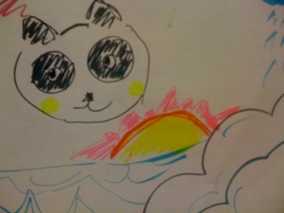
When I worked with children in the senior year of my high school career, I was honored to receive drawings from students I tutored in the third grade. On the right, my student Jenny drew animals and a background and knew exactly where the placement for each subject is suppose to be. For example, she had a linear perspective because she placed the clouds above the heads of the animals and the ground below. She was even able to place the duck closer to show it is larger. In her illustration with the little girl, she was able to have a sense of balance and place the girl in the middle so that the picture would not be imbalanced.
On the left is an illustration by a boy that I asked to draw anything he wanted. He was able to use warm colors for the sun instead of outrageous colors that do not represent the symbol of the sun. Children are able to know what colors complement each other and what specific objects are "normally" colored.
Next time, take the time to notice art pieces by younger siblings, children, students, or even babies because it is really interesting seeing how their brain helps them put things together without them really knowing what they are doing. Who knows, maybe one day they will be the next famous designer!
Monday, October 18, 2010
Design in the Mind of a Child
Comparison and Contrast

In the beginning Google's logo started off with the letter G with a bright and light green matching the letter L that later follows the word. It looked flat and two-dimensional when it first started as a company. Slowly as the company became famous over the years, the logo changed a total of three times. In 1998-1999, the new Google logo added an exclamation at the end of it as well as change the green G into a blue color. The colors from each three changes has gotten brighter as well. From 1999 until now, Google's logo has been kept the same as 1998-1999, except bigger, has shading to give it a more three-dimensional look, no exclamation mark, and thinner letterings.
There are a few similiarities among the three logos after changing three times. One is that the font of the logo stayed similar other than the thickness of the lettering. They used the same colors to represent their company throughout each change because a dramatic change would honestly not be easy for consumers and the world to adjust to after being use to one icon for a certain company. The three logos always had some sort of light shadowing around each letter, yet it became more apparent in the most recent Google design making it look more three-dimensional.
Overtime, technology helped make the logo look more modern and attractive. It also helped the design of the word Google stand out more for viewers to notice compared to the previous two, which were dull and the coloring were not as nice. In the end, the designers helped start off an icon for the Google company that would make everyone around the world recognize it instantly as well as improved the initial look of Google.
Design as Conversation
Conversation means exchanging ideas and views through speech, visual communications, and etc. People are able to bring their perspectives across through design as well as many other techniques like speech, lyrics, and pictures.

 Designs all over the world speak out loud to everyone. Images on billboards, advertisements, posters, magazines, and even the media revolve around designs to help bring the idea across. For example, to the right is an advertisement for the a fibre company called Tweeter. Using a simple subject which in this case is a pool stick and its chalk to persuade the public to "Stick With Us." They are trying to convince viewers that they should stay with being regular customers to the company as well as welcoming new consumers to be a part of their company. This advertisement had a simple slogan that was straight to the point, whereas some advertisements speak without words and still have the idea come across. On the left, there is the Playstation advertisement that brings the idea that the product is great without words, but simply the product itself. With the colors illuminating the product, it makes the product look as if it is a fantasy and dreamy. The colors were probably chose on purpose to show give the effect of a dreamy product so that people would want to purchase a beautiful item. The colorful design that wrap around the product and toward the sky somewhat shows the audience that it's not only dreamy, but it rises to the sky like it is a godly product.
 Simple examples like advertisements, which are all over the world, have a way with words and illustrations that bring their purpose across without verbal speech. Conversations are not necessarily used with just speech, but with the design world, anything can speak through the eyes.
Monday, October 11, 2010
Human Designs
 |
 As I was talking to a fellow classmate today, I stumbled across a phrase he said that inspired me to write this one blog entry. He mentioned how someone can be a great design or a bad design. I was intrigued at how he used the word design to describe a human being. It is quite true as well, because each and every person on this planet are their own person, thus their own design. The word of choice chosen was very appealing to me because I always saw the word 'design' as an item, art piece, or an idea, but never used when describing a person. Each person is made up of their own design, meaning their characteristics, personality, and appearance. They are also able to alter their personal design of themselves with the clothing they wear, accessories like hats and scarves, make-up, and even their hairdo. People are able to act and dress the way they choose which creates the many different people around the world. Appearances play a big role in the "design" of a person because it is what others first judge and see before getting to know a person. Then the personality of the person itself is another part of a design that can further help show others how they are. Different people from different parts of the world have their own way of presenting themselves with the way they dress because the design of how they are give people the first impression of how they might possibly be. First impressions do mean a lot and even though it's bad to judge a book by its cover, many tend to do so. But, each and every one person in the world have their very own unique design personality-wise and appearance-wise.
Finding Creativity From Without.

I can just simply look at any object in a room and notice the small fine details of how something is designed and marketed to the public. Like Gatorade drinks; they use simple bottle designs to market their product, but creating smaller versions of the original design also attracts consumers. The colors of the drinks also help draw in customers to buy the product. Simple marketing strategies like creating small bottles for children or easy grab-and-go bottles intrigue more people to purchase. Although the saying, "Don't judge a book by its covers," I believe many people out there do still judge everything upon looks first. That's because what you see is the first impression of anything you buy or get to know later on. As for items like Gatorade, you tend to buy things that are more appealing to you or that it draws you more toward it. For example, I personally like the blue-ish, teal Gatorade drink, but not only does it taste good to me, it is also my favorite color and I purchased the smaller bottles of Gatorade because it's convenient for me to take to school and it looks "cuter." Little details like that can really persuade a person toward purchasing a certain item. Thus, looks do matter, especially in the business marketing world.
The business world incorporates designs into their products. Like the Gatorade bottles, they get designers to create the bottle appearance to draw more customers to buy them. Little fine details of even how a bottle appears inspire me to notice that the world is based on designs of almost anything anywhere. Looks do matter when it comes to marketing strategies, which is one career field that I am very interested in working for in the future. Little consumer products help inspire me to work toward my goal to becoming an advertisement marketer if I cannot achieve my ambitious goal of working for Pixar.
"Stone Soup"
"Stone Soup" by Marcia Brown illustrated the achievements of being able to bring in different kinds of materials to create a new worthwhile product. Our group assignment on Tuesday was to bring in different art materials to create our own rewarding product. Although strangers, my group was able to bring in different items ranging from art supplies to sewing materials and crafting scraps to make our own "Stone Soup." We did not literally create soup, but we were able to make our very own product with what we had.
My group was able to come up with creating a person out of all our materials and scraps. We began with the head and used a plastic Nike bag. We stuffed the bag with a lot of white printing paper to make the head more three-dimensional. Then, we decided to wrap the plastic bag with a silver-colored tissue paper so the head would not have Nike printed all over it. Our "person" was able to hook onto a clothes hanger and attach to a rectangular cardboard box to connect him to his body. We were able to create his arms and legs out of paper and cover his cardboard box body with a t-shirt someone brought in. We were able to be creative with him by designing him to be a person crossing his legs as he leans on the ledge with his arms crossed. We also had rainbow string to work with and used it to create his very stylish hairdo. My group also got lucky with having heart-shaped gems that we used as his eyes and a rubber-band as his mouth. In the end our result was really rewarding. Everyone was really proud of what we accomplished together. With our limited resources and how each and every person came from a different background, we were able to put our heads together to make our creation: Dessie (name given by Professor Housefield).
Design creations from a single mind would probably be great, but possibly even better when eight minds are at work. I believe that design creations have minds behind it rather than one particular head working on the piece. In my opinion, whether it is inspiration from others or the help of others to create one art-piece, designs seemingly end up better with more than one brain at work.
Monday, October 4, 2010
First Impressions of Design
 First impressions last a lifetime. Although it is hard for me to pull from my memory bank what my very first impression of design was, I know design has definitely made a strong impact in my life. Design and artwork that surrounded my childhood immensely helped me decide on my path toward majoring in design: visual communications. Although I have just started studying design in college, I have had many experiences with art projects and practicing with assignments I had. In the end, I know that slowly, but surely I am determined to reach my goal of working for Pixar.
One memory that stuck by me was when I was in elementary school at Lawton Alternative School in San Francisco. My fourth grade teacher, Mr. Greene, helped me realize I would like to become an artist when I grow up. He was in love with art and many times he would incorporate art into our daily lessons in class. He inspired me to become an artist because of the many artwork we did in class that he eventually sent to the Asian Art Museum in San Francisco for a weekend exhibition on student pieces. He constantly encouraged me that my work was good and could take me places in the future as an artist. I kept that thought close-by and eventually became intrigued in becoming a designer.
The memory of my fourth grade teacher stuck with me all these years and helped me further my interests in art. My most recent piece is one of my proudest work yet. I used magazines and cut them into bits and pieces to form a collage of my hometown. I combined the Golden Gate Bridge along with the Bay Bridge and used gold magazine scraps for the city in the background. I also added white magazine pieces for the fog. I was able to submit this piece into the American River Review, which is a magazine created by students of American River College in Sacramento. They select a few of the best pieces in the school to be presented in the magazine each year. I received many positive feedbacks from this collage from friends, family, classmates, and my professor. This further encouraged my dream in becoming a designer.
The effort I took to create the collage took a few days to put together, but the design was inspired by my beautiful city. Those that designed the bridge inspired this piece, too because of their skills in photographing the city. Different types of art like photography and architecture, the designer creates how they want the bridge to appear and how to perfectly set the camera to snap a picture at the perfect spot and time. In the end, my creativity put together the architecture design of the bridge and a photograph of the city into a collage.
Design comes in different techniques and forms. Through almost anything or anyone, it could inspire a lot for one’s mind.
Even In The Smallest Places Design Exists!


